Striking, is it not? I simply must say that this is without a doubt, one of the most unexpected visual offerings of the year! The United States Post Office has again struck gold with the 18-35 year old male demographic; even more so than with its previous foray into the very soul of the American mind. This astonishing, dare I say rogue attempt to gain more interest in “traditional” mail is certainly eye-catching. That is to say, there’s nothing “traditional” about it! It just feels so…so real, so genuine. Clearly the USPS is gaining ground on the humanitarian approach to hand-delivered mail, and my oh my what a way to do it.
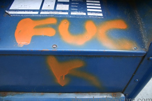
Look at those irresistible curves, the perfectly contrasted orange laid gracefully atop the trademark navy, the perfectly weathered rust and that just-ever-so-slightly peeled back corner of the sticker! Talk about hitting a home run! Scratch that, this prodigally designed mailbox is a grand slam! It’s easy to see that they obviously had their best people working on this new layout. I don’t even want to think about the hours put into the conceptualization of this so-much-more-than-a-mailbox. This is breathtaking. Honestly, what a risk the USPS is taking here. Not only is a historically taboo word being used in the design, but it’s being separated, and in a sense, being dislocated from its original spelling. Perhaps the USPS is aiming at a reinvention of one of the most popular “foul” words in the English language. I for one am going to just love guessing for weeks to come!
Never before in my life have I been beckoned so to send mail of any kind. I cannot wait to see more mailboxes in the area decorated in the same fashion nor can I wait to see what’s in store for us next!
 recent rot on a&o


The Successor To The Official USPS R2-D2 Mailbox
Striking, is it not? I simply must say that this is without a doubt, one of the most unexpected visual offerings of the year! The United States Post Office has again struck gold with the 18-35 year old male demographic; even more so than with its previous foray into the very soul of the American mind. This astonishing, dare I say rogue attempt to gain more interest in “traditional” mail is certainly eye-catching. That is to say, there’s nothing “traditional” about it! It just feels so…so real, so genuine. Clearly the USPS is gaining ground on the humanitarian approach to hand-delivered mail, and my oh my what a way to do it.
Look at those irresistible curves, the perfectly contrasted orange laid gracefully atop the trademark navy, the perfectly weathered rust and that just-ever-so-slightly peeled back corner of the sticker! Talk about hitting a home run! Scratch that, this prodigally designed mailbox is a grand slam! It’s easy to see that they obviously had their best people working on this new layout. I don’t even want to think about the hours put into the conceptualization of this so-much-more-than-a-mailbox. This is breathtaking. Honestly, what a risk the USPS is taking here. Not only is a historically taboo word being used in the design, but it’s being separated, and in a sense, being dislocated from its original spelling. Perhaps the USPS is aiming at a reinvention of one of the most popular “foul” words in the English language. I for one am going to just love guessing for weeks to come!
Never before in my life have I been beckoned so to send mail of any kind. I cannot wait to see more mailboxes in the area decorated in the same fashion nor can I wait to see what’s in store for us next!
Leave a comment
Filed under commentary, reviews
Tagged as Chicago, curse words, fuck, mailboxes, petty crime, spraypaint, swear words, tagging, uninspired acts of criminality, United States Postal Service